On April 11, 1968, the official government policy of “redlining” came to a definitive legal end.
Contained within Title VIII of the Civil Rights Act, signed into law by President Lyndon B. Johnson, was a clear instruction to banks and other lenders not to discriminate on the basis of “race, color, religion, or national origin.”[1] In the strictest sense, the prohibition worked. Financial institutions abandoned the racist maps that had ruled mortgage markets for three decades, and capital flowed into neighborhoods as never before. Yet, many of the underlying inequities—in loan denial rates, in pricing, in socioeconomic outcomes—persisted.
Scholars have puzzled over this inertial injustice ever since. In researching my new book Keeping Races in Their Places: The Dividing Lines That Shaped the American City, I surveyed much of this literature, and I found a common theme. The maps were but a symptom—albeit a blatant and disastrous one—of a more subtle governing ideology that suffused the housing finance system.
Redlining, in other words, was not just a policy. Redlining was a philosophy—a pernicious, often unspoken logic that guided our laws and our markets—and it did not end in 1968. To the contrary, it pervades our society to this very day.
When Americans first learn the history of redlining, it is usually accompanied by a map like this one:
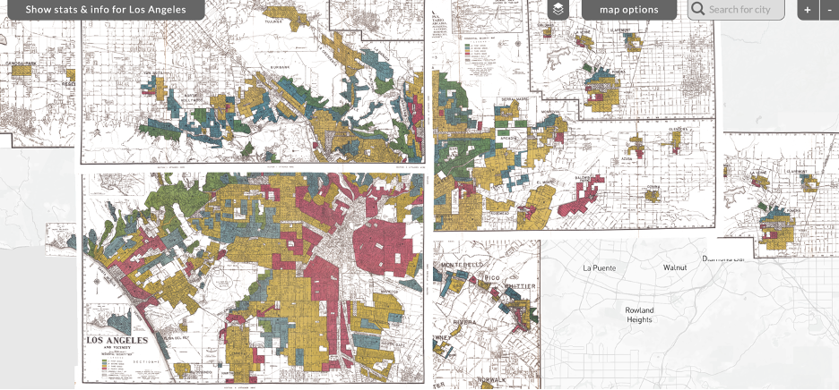
Appraisers drew this map—and others like it all over the country—at the behest of the Federal Home Loan Bank (FHLB) Board in the late 1930s. It advised lenders where to invest their capital—essentially, who should get mortgage loans to buy houses, and who should not. The red neighborhoods received the lowest “grade,” rendering them off-limits as far as the FHLB Board was concerned—and since the Board passed these instructions on to the savings and loan (S&L) institutions that it regulated, the red neighborhoods were off-limits as far as most S&Ls were concerned too. The Federal Housing Administration (FHA) drew its own maps, following the FHLB Board’s quite closely, and the blockade was nearly complete.[2]
This was redlining as policy, and it was explicitly racist. The map above is accompanied by the appraisers’ comments, wherein they repeatedly refer to the “melting pot” demographics as a justification for assigning red grades to the South Central neighborhoods. In case the point was not clear, they explain that the area “is literally honeycombed with diverse and subversive racial elements.”[3] The maps are saturated with this language and worse in nearly every city.
In recent years, economic historians focused intently on two questions: First, was race a statistically significant factor in drawing the lines, or was it merely a correlate that followed other factors, like income and building quality? Second, did the maps worsen outcomes for the redlined neighborhoods, or did they merely follow patterns of discrimination that were already in place by other means?[4]
These are important questions, but they assume a narrow definition of redlining. In both instances, redlining is nothing more than the maps—and any decisions that were made using the maps. This definition is a useful fiction. It reduces a complex set of actions to a quantifiable treatment effect. On one side of the red line is a treatment group; on the other, a control. Any variable that can be geocoded is a candidate for this natural experiment.
But this experiment, as defined by the legal enforcement of the maps, ended in 1968. To a naïve observer, it might appear that this form of discrimination has been illegal for over half a century.
The mistake is thinking that the maps were the motivation for discrimination. They were a tool. They were a guide. But they could have been ignored. They could have been redrawn. They could have been flipped on their head and used to lift up, rather than hold down, redlined neighborhoods.
No such thing happened, of course, because the map users held a philosophy in their heads that said the following: Capital ought to discriminate spatially, with the most plentiful, affordable, and productive capital going disproportionately to the neighborhoods that historically have been the wealthiest and Whitest.
The maps were not the only manifestation of this philosophy.
When the Roosevelt administration began building public housing, they could have built it throughout American cities. They could have built it in good school districts, so that the children of the tenants could climb out of poverty with a strong education. They did not. They allowed local communities to veto public housing in these school districts, and they designed public housing explicitly to replace slums, where the children could be assured of attending underfunded schools.
When the Nixon administration began subsidizing loans in formerly redlined neighborhoods, they could have followed the precedent they’d set in the predominantly White suburbs. They could have funded new construction with careful inspections and reasonable appraisals. They did not. As Keeanga-Yamahtta Taylor’s work has revealed, they financed crumbling old structures, they paid off contractors and inspectors and appraisers to underfund renovations and inflate prices, and they bankrupted poor Black families who took the only shot they had to build generational wealth.[5]
When urban residents vote to issue bonds or pay higher taxes to build affordable housing nowadays, they could locate these new developments close to jobs and hospitals and fresh, healthy food. Instead, the vast majority of siting decisions concentrate low-income residents in high-crime food deserts, far from the access to opportunity that is now proven to be a significant predictor of life outcomes.[6] When asked why not build more affordable housing in high-opportunity neighborhoods, they often answer that it is too expensive because the land is costlier. But the historian must ask, why is it costlier? And the answer, of course, is redlining.
Thus does the philosophy perpetuate itself.
What is striking about these examples is that, in each case, proponents have argued that their policies are designed to reduce racial inequities. Far from being motivated by racial animus, they often seek to fill the void left in these neighborhoods by redlining.
But the maps have tricked them into a shallow understanding of redlining. The void was never an absence of capital. Redlined neighborhoods have always had access to expensive, predatory capital—from the likes of loan sharks and installment contracts.[7] The hallmark of redlining was the stratification of finance: different tiers of capital for different “grades” of neighborhoods. Our markets and our laws continue to obey this stratification in many cities to this day.
When we teach the history of redlining, we might be better served by showing the maps alongside a graph like this one, from my research with Brian An and Seva Rodnyansky:
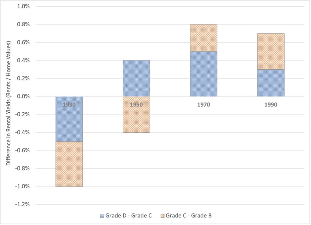
It shows difference in rental yields—the rent charged by landlords relative to the value of the property—between the redlined and non-redlined neighborhoods. In 1930, it was negative. Redlined neighborhoods paid less, proportional to the value of the property, than non-redlined neighborhoods. After redlining, it became—and remained—significantly positive. Redlining made it more expensive to live there. Landlords charged these tenants more because they perceived the risk to be higher.
This perception of risk—and this difference in prices charged to different neighborhoods for the same service—is the philosophy of redlining at work. Consciously or unconsciously, our society is guided by the same logic that guided the hands of the mapmakers of the 1930s. Capital discriminates where it has always discriminated, even when explicit racial motives no longer prevail.
And thus, spatial inequities endure.
[1] Anthony W. Orlando. Keeping Races in Their Places: The Dividing Lines That Shaped the American City, (New York, NY: Routledge, 2021), 76-92. (Ch.6)
[2] Ibid, 63-74. (Ch.5)
[3] See, e.g., https://dsl.richmond.edu/panorama/redlining/#loc=10/33.993/-118.297&city=los-angeles-ca&area=D52 and https://dsl.richmond.edu/panorama/redlining/#loc=10/33.993/-118.297&city=los-angeles-ca&area=D53.
[4] Orlando, Keeping Races in Their Places, 49-74. (Ch. 4-5.)
[5] Keeanga-Yamahtta Taylor. Race for Profit: How Banks and the Real Estate Industry Undermined Black Homeownership, (Chapel Hill, NC: University of North Carolina Press, 2019).
[6] See, e.g., all the research produced by the Opportunity Insights team at https://opportunityinsights.org. The siting decisions are documented more extensively through interviews with key stakeholders in “Maximizing the Spillover Impacts of LIHTC Developments: An Analysis of Los Angeles,” a forthcoming working paper by Brian Y. An, Raphael W. Bostic, Andrew Jakabovics, Anthony W. Orlando, Seva Rodnyansky, Richard Voith, Elizabeth Wang, and Sean Zielenbach.
[7] For recent evidence, see Ann Carpenter, Abram Lueders, and Chris Thayer. (2017). “Informal Homeownership Issues: Tracking Contract for Deed Sales in the Southeast,” Federal Reserve Bank of Atlanta Community and Economic Development Discussion Paper, no. 02-17, 2017.. https://www.atlantafed.org/-/media/documents/community-development/publications/discussion-papers/2017/02-informal-homeownership-issues-tracking-contract-for-deed-sales-in-the-southeast-2017-06-14.pdf.